General thoughts:
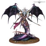
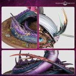
-I really love that they moved away from the overtly "snake" look, and more towards a sea serpent. (More in keeping with the Steeds of Slaanesh.) The bejewelled fins, the little lamprey-gill-esque holes, etc. ending in a sleek crab claw. It's something I've been a proponent of, so to see it come to fruition is immensely pleasing!
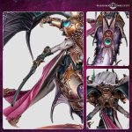
-Much more "Space Marine" than previous iterations, which is... interesting. His shoulder pads are pauldrons, his upper arms are power armoured, his wings are emerging from a power pack, and from neck to tail he's ribbed in a bodysuit. I suppose this means there will be no way to build him with the armour off (as you can with Magnus and Angron) which is a little disappointing - I was hoping for a suns-out-guns-out topless build. But it's a little weird that as a ten-thousand year corrupted daemon he's wearing more "standard power armour" than he has ever been portrayed in before.
-The colour scheme. As a proponent of "pink & black", I was hoping for a purple body, pinker flesh, and then black and silver/gold armour. (And red wings.) They've gone more gold, with a total absence of pink... which doesn't bode well for my preferences. What's weird though is that the art of him is clearly in pre-Heresy "purple & gold", but the 'Eavy Metal painters have just ignored that.
-(Sans) Sonic Cult. As a lover of the Emperor's Children as a Cult Legion, I was hoping for a 40k Fulgrim to stand out from his 30k version via a Noise Marine lean. Fan art I like includes things like a pipe organ collar, the standard inlaid speakers, bondage straps, piercings, etc. This has basically none of that (maybe the face mask, a little). It would also have tied him more into the faction's classic look, which leaves me to believe that the classic look of the faction is probably gone in many respects. (Or pigeon-holed to flanderised Noise Marines.)
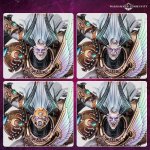
-The heads. Five head options is wonderful. Four of those five head options being different expressions is... less ideal. (Angry, angry mouth open, happy, happy mouth open.) The mask is neat (though doesn't wow me). I like the "heavy living" weathered look, but would have made at least one of the head options a pretty face for those who prefer that idea. Or like when Fulgrim calls to his Legion in Slaves to Darkness, and his throat ripples and inflates with red-wet gills opening up, to tie into the previous point about the Sonic Cult - would have loved the option of one screaming with distended jaw. Or a "gimp mask". Y'know... five options that actually mix it up.
-The orifice. It's strange - I can look at classic Noise Marine art and love it, or the current most extreme models that GW makes... things like the Infernal Enrapturess. No problem. And yet... the front of Fulgrim is unpleasant (to me), in a bad way. It's also a little busy... I think I'd have preferred the model if you just shortened that area and left it out. (If I end up getting the model, I'm going to have to figure out some way to get rid of this... I'm not that good of a sculptor... ugh...)
-The hair. Transfigured did it better.
-The horns. Transfigured did them in a more expected fashion... but sometimes the tropes are tropes for a reason. They're not objectively bad or anything, they just don't click for me.
-The Legion Symbol. Too 30k for my taste. I mentioned this with the previewed shoulder pads as well, but I prefer when the 40k symbol is wild, chaotic, fiery, and violent. (See the Lords of Excess cover.) This looks too rigid and pleasant to me - like something he would have worn ten thousand years ago.
-Accoutrements. The whip is a neat design, but the posing is kind of weird. Limp. Swords are a little dull looking.


